This article is in
The Spectator’s November 2019 US edition. Subscribe here.
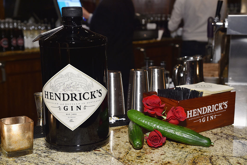
People don’t believe me when I tell them we created Hendrick’s Gin 20 years ago — mostly because the bottle looks like it’s been on the market for more like a century. Over the course of those 20 years, we’ve gone from an unusual little gin to a global brand. We sell more than one million cases a year. The secret is nostalgia.
Most of the products we design at Quaker City Mercantile, the creative agency I run in Philadelphia, are known as ‘nostalgia’ brands. Nostalgia can be a powerful thing, but it’s not as easy as slapping a faux-vintage label on and calling it a day. Any nostalgic design has to come from an inherent truth about the brand.
I don’t actually believe nostalgia marketing is a ‘trend’ — after all, I’ve been doing it for more than 30 years. However, there has recently been an uptick in 1990s nostalgia from major companies as they go after millennials. Targeting these now-adults with the classics of their childhood — Nintendo, Crystal Pepsi, reboots of 1990s TV and film — is effective in the short term, though without depth these companies risk falling into the ‘trend’ trap. In this era of the internet, where fashionable cycles sprint to catch up with memes, people crave authenticity.
For brands new and old, an element of nostalgia is key to ensuring a sense of authenticity, timelessness and a feeling of being transported. A flashy, of-the-moment design might catch your attention, but a brand that can harness the power of nostalgia is one you’ll keep coming back to, because it feels like home.
For Hendrick’s, we took our cue from the vintage stills used to create the gin: a Carter-Head from 1948 and a Bennett from 1860. The stills themselves are unlike the modern equipment used at most large distilleries, and reminded me right away of the mechanical creations in Jules Verne novels: porthole-like windows, shiny brass, pipes and knobs and dials. That led us to Victorian-era England more generally, which informed the look and feel of our brand world.
The bottle itself is also rooted in something authentic — a tiny poison bottle found in an old curiosity shop. We scaled the same shape up to the standard size for a bottle of gin and kept the black glass for a Victorian apothecary feel.
The result stands out on a shelf, which is key for any successful brand. But the same could be true for any number of trend-chasing packages (like the dozens of identical slim white cans of hard seltzer flooding coolers this past summer). They may turn heads in the moment, but in a few years they’ll look hopelessly dated.
Hendrick’s Gin still looks good two decades later because it manages to balance nostalgia with a sense of timelessness. It draws on many influences, obscuring its true origin — you can’t quite tell if it’s from 1899 or 1999, so it feels as if it has always been around. There’s something familiar about it, and if a brand has been ‘around forever’ in a consumer’s mind, it must be doing something right.
It isn’t easy to capture nostalgia. In fact, several of our most successful projects have been heritage beer brands looking for a way to get back on track. In a world where craft beer is carving out its own piece of the market and craft-beer drinkers are always on the hunt for the next big thing, nostalgia might seem quaint, but it’s an asset that brand-new breweries don’t have.
Narragansett Brewing Company (est. 1890) was once the largest beer brand in New England, but had been in decline for several decades before we helped new owner Mark Hellendrung revive it in 2005.
The first step in this process was redesigning the iconic lager can. Like the Hendrick’s bottle, it looks like it’s been around forever — but it’s not simply a reproduction. We rummaged through the brewery’s archives and combined elements of can designs from the 1940s, 1950s, and 1960s with some modern touches to create a package that works in today’s world. It feels familiar to New England old-timers who grew up with the brand, and retains a layer of authenticity that’s catnip for hipsters. (That authentic feel helped us dethrone Pabst Blue Ribbon as ‘King of the Hipster Beers’ in Brooklyn a few years ago.)
As we dug deeper into the ’Gansett archives, two nostalgic pop culture connections helped us add layers to the brand. First, we reissued the 1975 can that gets crushed by Captain Quint in the film Jaws. By combining an old-fashioned design with nostalgia for the classic film, we had an instant summer hit. Second, we uncovered a series of Narragansett advertisements from the 1940s illustrated by Theodor Geisel — also known as Dr Seuss. It’s a surprising piece of historical trivia that takes everyone back to a simpler time.
For New Englanders past and present, it feels like home. For everyone else, its friendly tagline — ‘Hi Neighbor! Have a ’Gansett!’ — immediately evokes a small town where everybody knows your name and would love to crack a beer with you on the porch. It’s something worth remembering.
This article is in The Spectator’s November 2019 US edition. Subscribe here.


